12 Fresh Small Kitchen Color Ideas to Make Compact Spaces Feel Larger
This post contains affiliate links. If you buy something through them, I may earn a small commission at no extra cost to you.
Beige isn’t “safe” — it’s a missed opportunity. Most small kitchens default to builder-grade white or sad taupe because someone once said dark colors “shrink a room,” and nobody questioned it since.
The truth is more nuanced, and way more interesting. The right small kitchen color ideas use tone, contrast, and sheen to trick the eye into seeing more square footage than you actually have. Let’s break down the 12 palettes that pull it off.
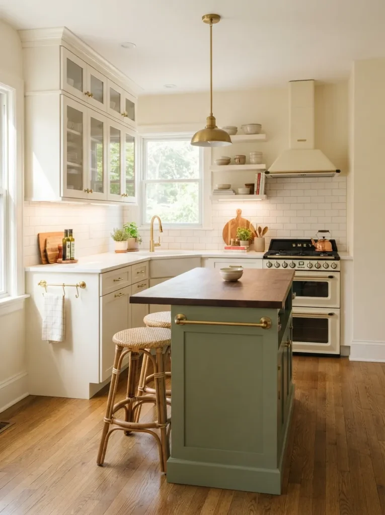
1. Start With a Bright, Warm White
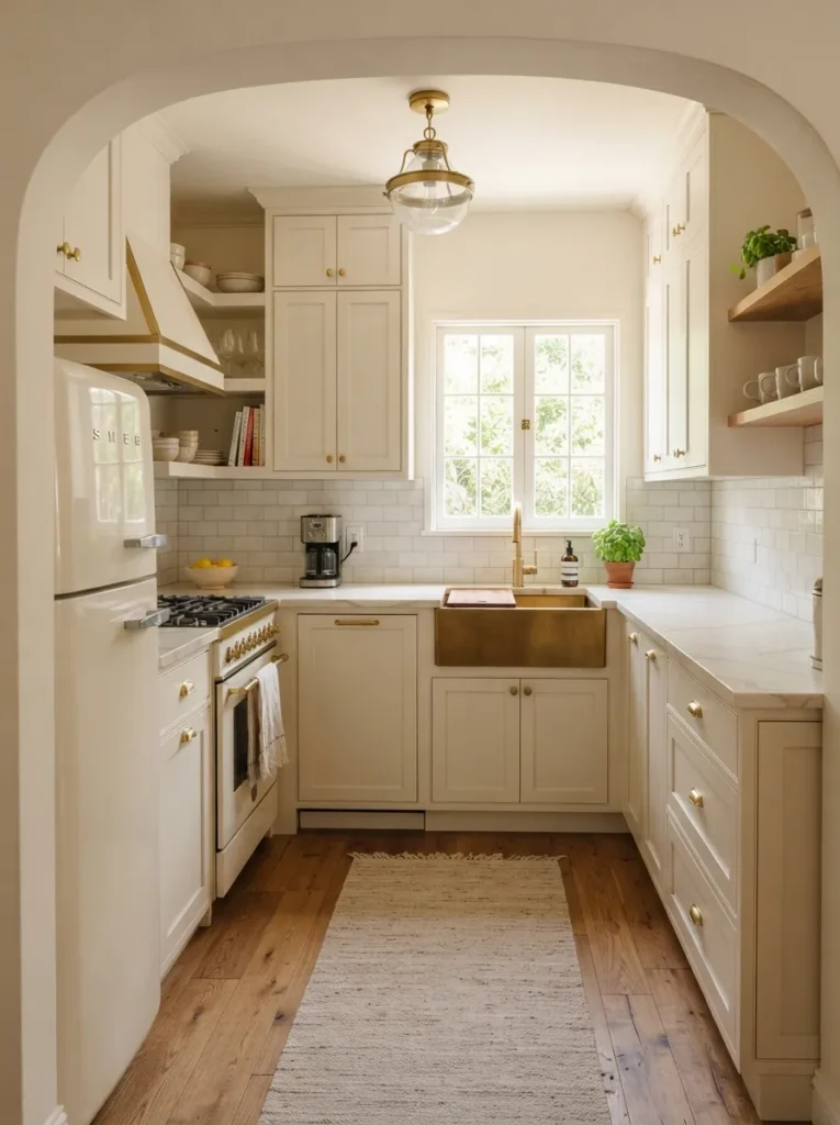
Warm white is the reigning champion of small kitchen color ideas, and it’s not just a trend — it’s optics working in your favor.
Why this works: Warm whites (think creamy, not stark) reflect available light without the sterile, clinical feel of a cool-toned white.
Material to avoid: Bright, blue-based whites. They photograph crisp but can feel cold and flat under average kitchen lighting.
Design insight: Pair warm white cabinetry with a natural wood or brass accent to keep the palette from feeling one-note or builder-grade.
2. Try a Reflective Pastel Palette
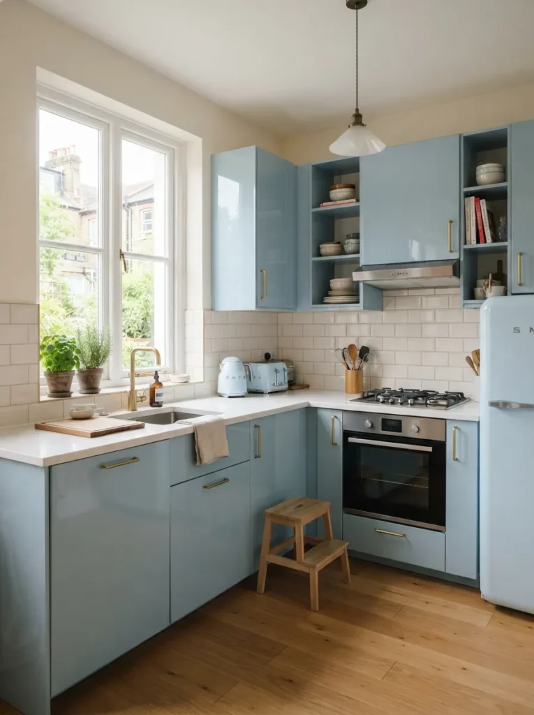
Pastels get dismissed as “too soft” for a serious kitchen, but a glossy, reflective pastel actually behaves a lot like white — just with more personality.
Design insight: Choose a soft blue, blush, or buttery yellow in a satin or semi-gloss sheen. Matte pastels absorb more light than they bounce.
Pro: Pastels add warmth and character without the visual heaviness of a saturated, dark color.
Con to consider: Pastels can read dated fast if paired with the wrong hardware — stick to brass or matte black to keep it feeling current.
3. Go Moody (But Smart) With Sage Green
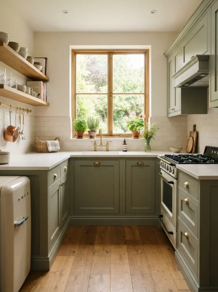
Sage green is proof that a small kitchen doesn’t need to live in white to feel open and airy.
Why this works for small kitchen color ideas: Sage sits in a mid-tone gray-green family that reads as calming and grounded, without the visual weight of a true dark color.
Spatial advice: Use it on lower cabinets only, keeping uppers in a lighter tone — this “grounds” the room without shrinking the ceiling line.
Lighting tip: Sage shifts dramatically under warm versus cool bulbs. Test a swatch under your actual kitchen lighting before committing.
4. Build a Low-Contrast Monochromatic Scheme
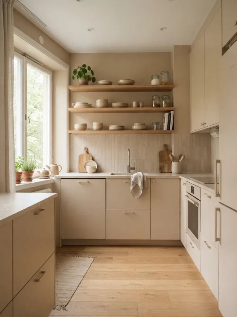
A monochromatic scheme keeps walls, cabinets, and even backsplash tile within the same tonal family — different shades, same color story.
Design insight: This removes visual “stopping points” for the eye, letting the whole room read as one continuous, larger surface.
Pro: It’s nearly foolproof — hard to get wrong once you’ve picked your base tone.
Material to avoid: Introducing one bold, unrelated accent color breaks the entire effect. Save contrast for texture (matte vs. gloss), not hue.
5. Add High-Contrast Accent Cabinetry
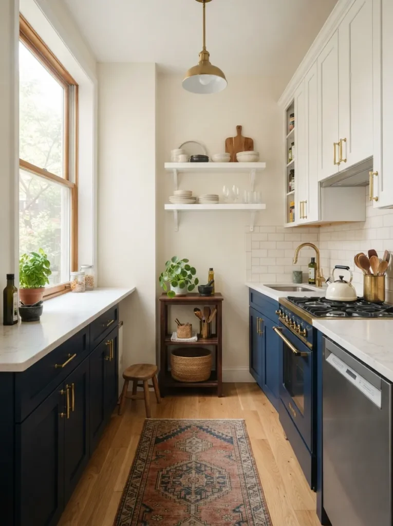
Counterintuitive but true: a bold, dark accent color on lower cabinets only can make a small kitchen feel more intentional, not smaller.
Why this works: Keeping uppers light and lowers dark creates a grounded, layered look, while the ceiling and walls stay visually tall and open.
Spatial advice: This two-tone approach works best when the dark tone stays below eye level — once it climbs the walls, the shrinking effect kicks in for real.
Pro: It’s the easiest way to add drama without repainting the entire room.
6. Choose a Single Statement Wall Color
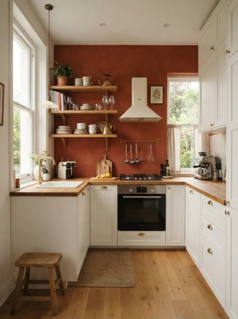
If a full-color kitchen feels risky, commit the boldness to just one wall — often the one without upper cabinets blocking the view.
Design insight: A single accent wall creates depth and focal interest without visually compressing the whole room.
Lighting tip: Position it opposite your main light source so the color catches natural light throughout the day instead of sitting in shadow.
This is the lowest-commitment way to test a bold small kitchen color idea before going all-in on cabinetry.
7. Use Color to Visually Extend the Ceiling
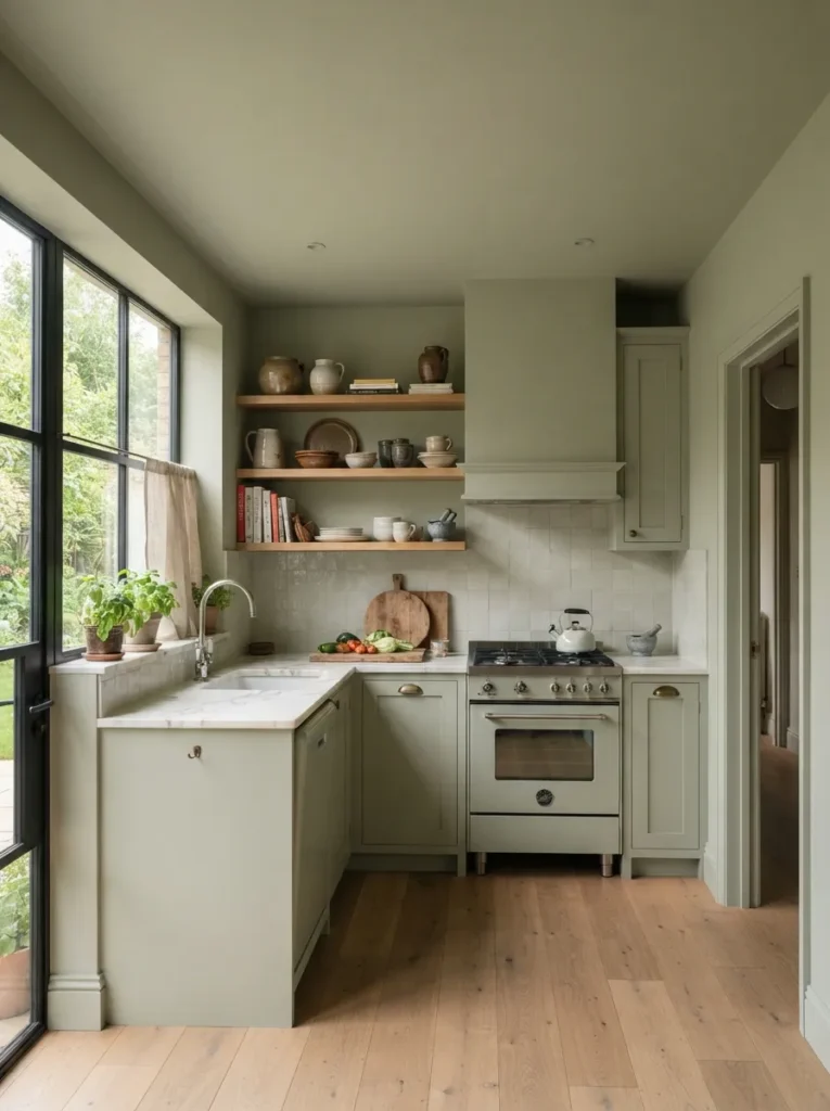
Painting your ceiling the same soft tone as your walls removes the visual “lid” that a stark white ceiling can create in a low-height room.
Why this works: Without a hard color break at the ceiling line, your eye reads the walls and ceiling as one continuous plane — which feels taller, not shorter.
Material to avoid: High-gloss ceiling paint. It reflects light unpredictably overhead and can look more like a mistake than a design choice.
Stick to a flat or matte finish here, and let the walls carry any sheen instead.
8. Sample Before You Commit With Peel-and-Stick Swatches
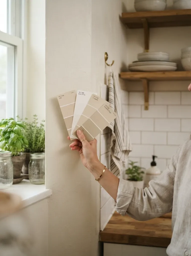
Paint chips lie. What looks perfect under store fluorescents can shift entirely under your kitchen’s actual daylight and bulb temperature.
Lets you test true color and sheen directly on your wall before buying a full can.
🛒 Check Price on AmazonPro tip: Test your top color choices at three points in the room — morning light, midday, and evening artificial light — before making it final.
This one small step prevents the single most common (and expensive) small kitchen color mistake.
9. Add a Reflective Sheen With the Right Paint Finish
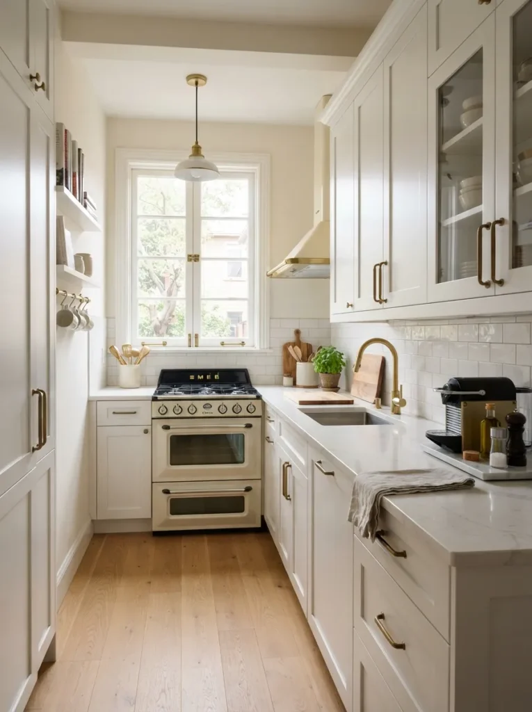
Color isn’t the only variable that matters — sheen does just as much heavy lifting in a small kitchen color idea.
Reflects light beautifully while resisting daily fingerprints and grease better than flat finishes.
🛒 Check Price on AmazonDesign insight: Satin and semi-gloss finishes bounce more ambient light than matte, making the same color feel brighter and more expansive.
Con to consider: Higher sheens show surface imperfections more readily — sand and prime properly before painting.
10. Refresh Hardware to Complement Your New Palette
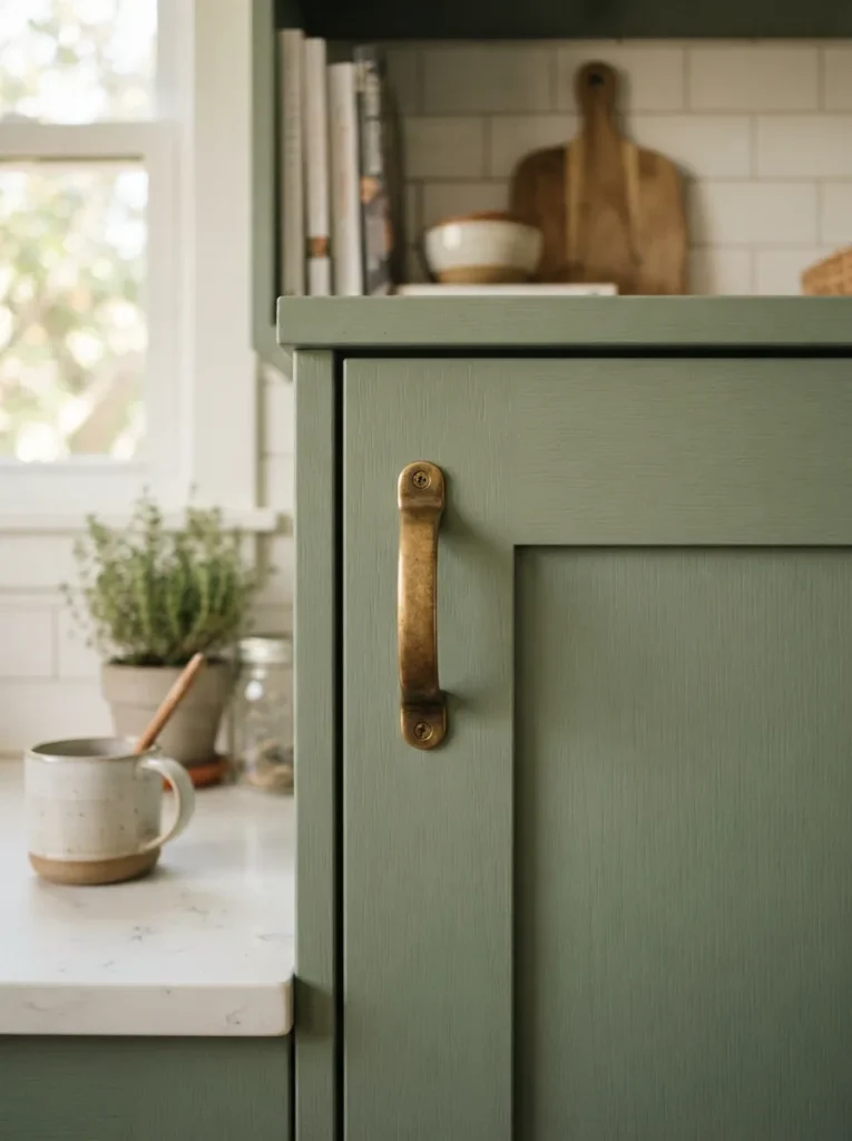
A new paint color only tells half the story — your hardware finish either supports it or fights it.
Adds warmth and complements both light pastels and deeper accent colors without clashing.
🛒 Check Price on AmazonDesign insight: Warm metals (brass, gold) pair beautifully with warm palettes, while cool metals (chrome, nickel) suit blues and grays.
Swapping hardware alongside a paint refresh ties the whole color story together for a fraction of a full renovation budget.
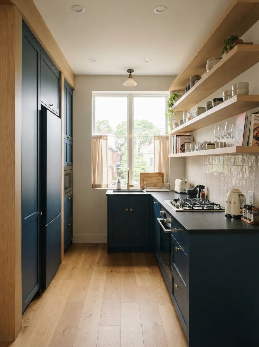
11. Balance Bold Color With Natural Wood Tones
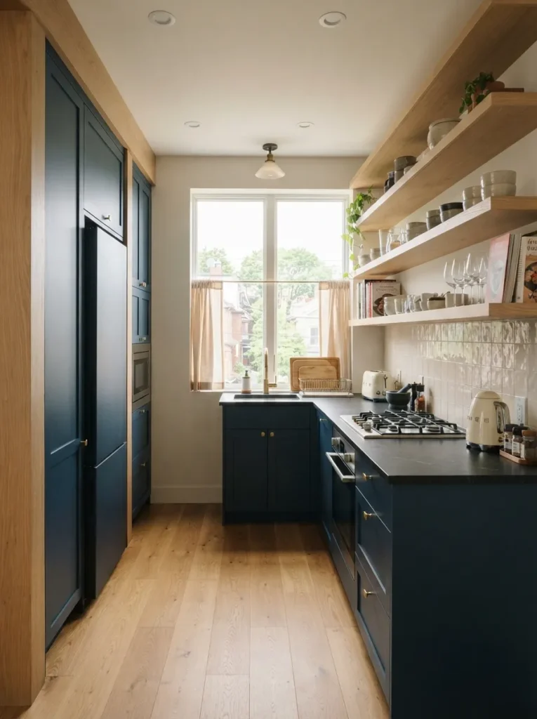
Bold, saturated cabinet colors can feel heavy in a small footprint unless they’re balanced by something organic and light.
Design insight: Pair a deep accent color with light oak shelving, a butcher block counter, or natural wood flooring to keep the palette grounded, not overwhelming.
Why this works for small kitchen color ideas: Wood tones read as warm and textural, softening the visual weight of a darker paint choice.
Pro: This combination photographs beautifully and ages well, unlike trend-driven color pairings that date quickly.
12. Use Color Zoning to Define Open-Concept Kitchens
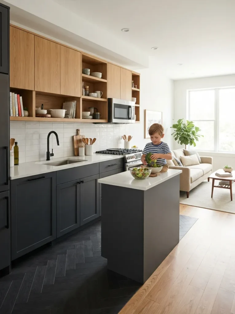
In open-concept layouts, color can do the job walls used to do — quietly defining where your kitchen ends and the next room begins.
Spatial advice: Choose a kitchen palette that complements, rather than matches, your adjoining room’s color story for a cohesive but distinct zone.
Design insight: A shared trim color across both spaces keeps the transition feeling intentional rather than accidental.
This approach lets a small, open kitchen feel like its own defined space, even without a single wall to separate it.
Color is the cheapest, fastest tool you have for making a small kitchen feel bigger — and most people never even test it properly. Grab a swatch, pick your tone, and let paint do the heavy lifting your square footage can’t.